Examples
Ten charts, ten URLs.
Each chart below is drawn from the URL under it. Copy one, put in your key and your numbers, and paste it anywhere an image goes.

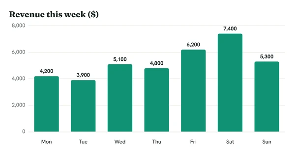
Weekly revenue
Seven days of revenue for a Monday morning email report.
https://c.renderchart.com/?key=rc_pub_live_7Hq2mX9pLk4vN8sT1wEa
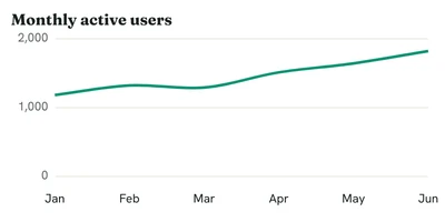
Sheets KPI
A compact trend line to sit next to a number in Google Sheets.
https://c.renderchart.com/?key=rc_pub_live_7Hq2mX9pLk4vN8sT1wEa
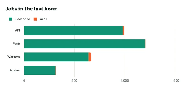
Slack status chart
Jobs by service for an hourly Slack post, failures stacked on top.
https://c.renderchart.com/?key=rc_pub_live_7Hq2mX9pLk4vN8sT1wEa
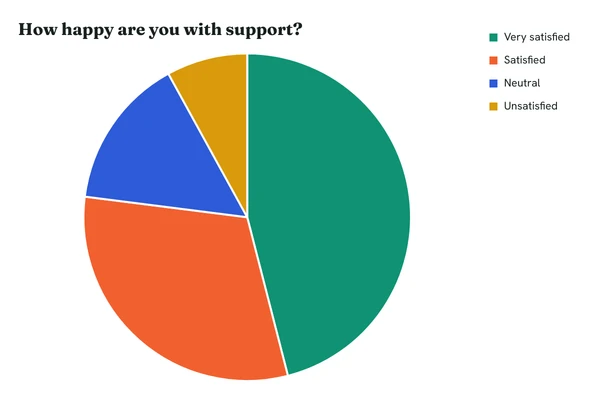
Survey results
Answers to one question as a pie, for a newsletter or a report.
https://c.renderchart.com/?key=rc_pub_live_7Hq2mX9pLk4vN8sT1wEa
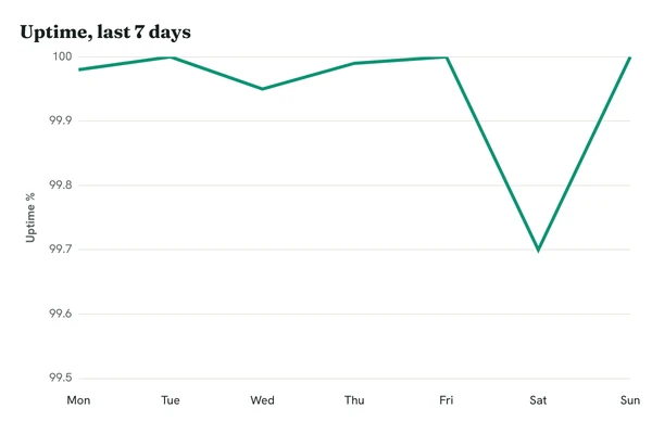
Status page uptime
A week of uptime on a tight scale, for a status page or an incident review.
https://c.renderchart.com/?key=rc_pub_live_7Hq2mX9pLk4vN8sT1wEa
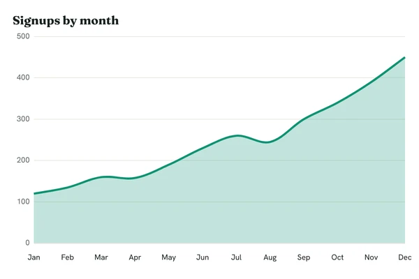
Monthly signups
A year of growth as a smooth area chart.
https://c.renderchart.com/?key=rc_pub_live_7Hq2mX9pLk4vN8sT1wEa
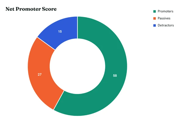
NPS breakdown
Promoters, passives and detractors as a doughnut with the values shown.
https://c.renderchart.com/?key=rc_pub_live_7Hq2mX9pLk4vN8sT1wEa
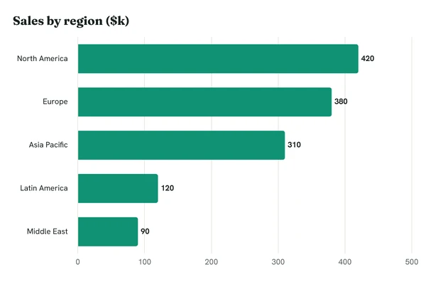
Sales by region
Horizontal bars for long category names.
https://c.renderchart.com/?key=rc_pub_live_7Hq2mX9pLk4vN8sT1wEa
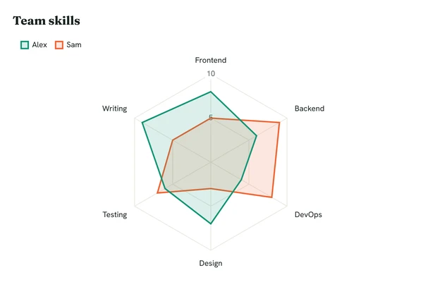
Skills radar
Two people compared across six skills.
https://c.renderchart.com/?key=rc_pub_live_7Hq2mX9pLk4vN8sT1wEa
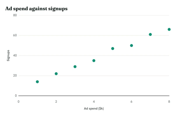
Correlation
A scatter plot of two measures, such as ad spend against signups.
https://c.renderchart.com/?key=rc_pub_live_7Hq2mX9pLk4vN8sT1wEa
Sizes that suit each place.
w and h are in CSS pixels; the image is drawn at twice that by default, so it stays sharp on high-density screens.
- Email report
w=600&h=400, the usual width of an email body.- Google Sheets cell
w=400&h=200. Labels stay at 11px, so they still read in a cell.- Slack message
w=600&h=300, so the chart fits a preview without a click.- README or Notion
- The default, 600 x 400.